DESIGN
This section highlights America the Beautiful graphics and campaign visual identity. Type, color and graphic elements all work together to bring the campaign to life. Whenever creating campaign-branded materials, please consult these guidelines to ensure consistent usage of logos and campaign identity.
Font Usage Guidelines
Gotham and Mercury Display typefaces to be used throughout the campaign. Mix of a strong sans serif and a classic serif font visually showcase how America is constantly evolving from old to new.

Color Palette Guidelines
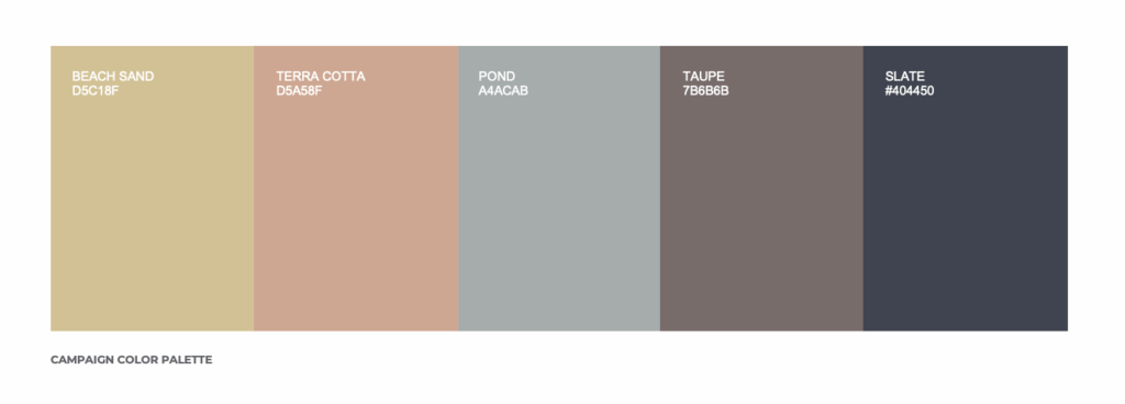
The color palette for the campaign is inspired by photography-driven creative and features a neutral scheme.
Editorial Design Guidelines
Primary Tagline Construction – The tagline should never be reproduced or typeset. Always use the original digital artwork to maintain the consistency and integrity of the lockup. This is the primary tagline construction and should be used whenever possible. When space is limited, refer to the below reference for stacked tagline construction.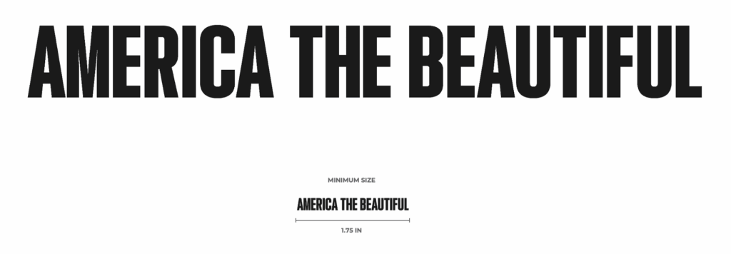
Stacked Tagline Construction – The tagline should never be reproduced or typeset. Always use the original digital artwork to maintain the consistency and integrity of the lockup. Stacked tagline construction should be used sparingly and only when space is limited. Usage of two-line or three-line depends on what works best within the layout.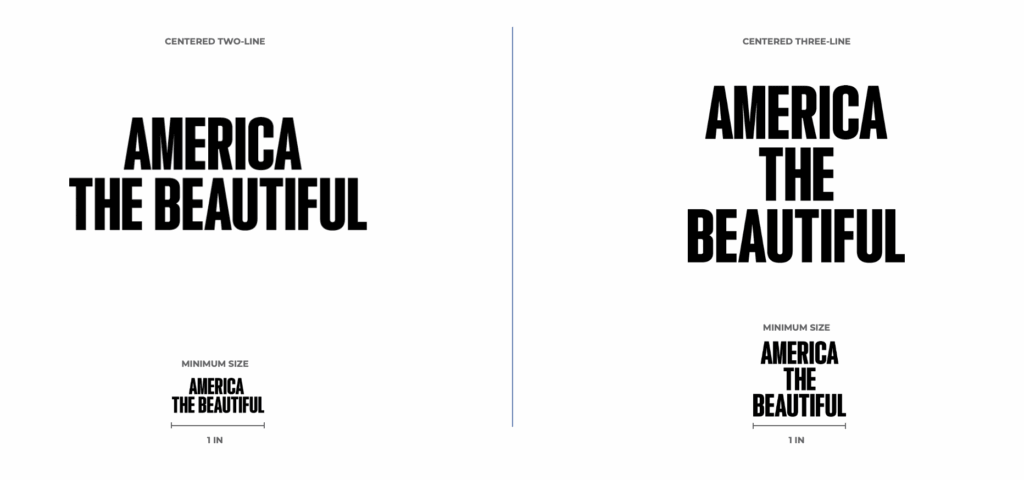
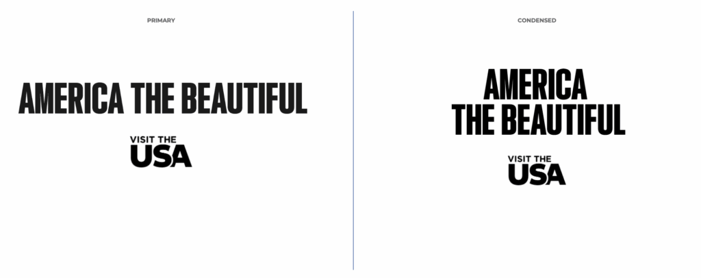
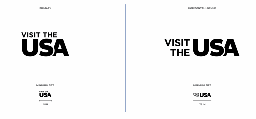
Campaign Logo – We are using a logo variation that states “Visit the USA.” This logo should be used for the America The Beautiful campaign.
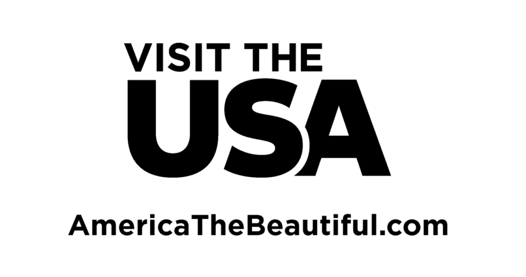
Logo and URL Lockup – When the logo is featured with the URL isolated, it should look like this.
Logo and Campaign Tagline Lockup – The campaign tagline with the logo and needs equal visual weight, use either of the lockups shown below.